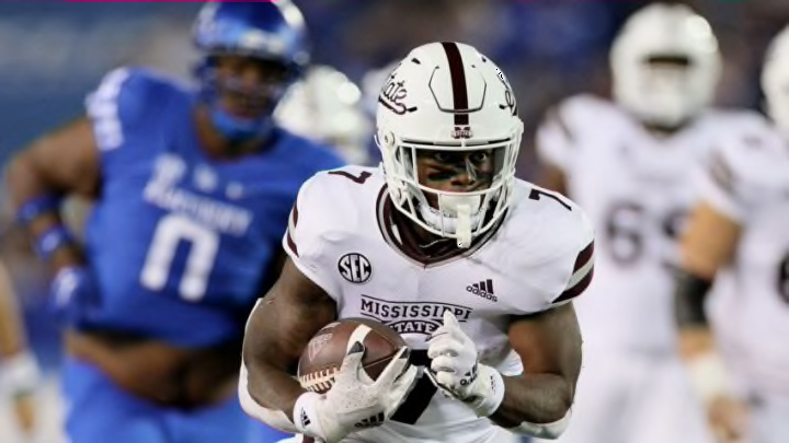
With the departure of John Cohen as Mississippi State’s Athletic Director, it is time for the university to press the reset button. Mississippi State Athletics needs a new look.
Let’s take a look at how our university is branded. Words like “Family” and “Together” are posted all over our athletic program in a literal sense, yet the actions of our athletic department, and simply the entire landscape of college sports, says otherwise. Oh, did I type “says?” I meant screams. With every player in the college athletics atmosphere looking for the best place to make a buck, “family” and “together” are not words that express the true culture of collegiate athletics. A new look and marketing scheme is something Mississippi State is in need of.
“The Banner”
Listen, I hate the banner as much as the next guy. It’s outdated. It screams 2012. The M-State logo is clunky and awkward. The long wording of “Mississippi State” stretches across jerseys creating non-symmetrical visuals and ugly angles. It is bad and we can all acknowledge that.
I don’t have all the answers to fix this issue. For all academic purposes, the banner logo is actually a good one. It’s big, gets the point across, and is easy to read. But for our athletic program, we need to have something that sticks out, is appealing to the eye, and could make a person who randomly switches the channel to a Mississippi State game say, “Wow, I like those helmets!”, or “Mississippi State”s jerseys look really clean!”. Across the nation, those words are not muttered often.
New Beginnings
All of that to say, I think it is time for the “Banner” as our primary athletic logo to take a backseat. The “State” script is a good start. The “State” block letters are a great idea, let’s keep working on it. Old logos such as the “Walking Bully” or “Interlocking MSU” are great, let’s pull some inspiration from them. In my opinion, the new athletic director has an opportunity to set fresh eyes on the dilemma at hand, and do something special here at Mississippi State. Create a fresh new brand of athletics here at Mississippi State. One with energy, one that doesn’t settle for less, and one that will always be competitive. Listen to the fans, research and utilize our history and our logos in the past, and work with our sponsor at Adidas to create something new. It’s time for a change, and I hope our new athletic director can see a similar vision.
For a look at past, present, and possibly future uniforms and branding, check out “@HailStateUnis” on Twitter.
